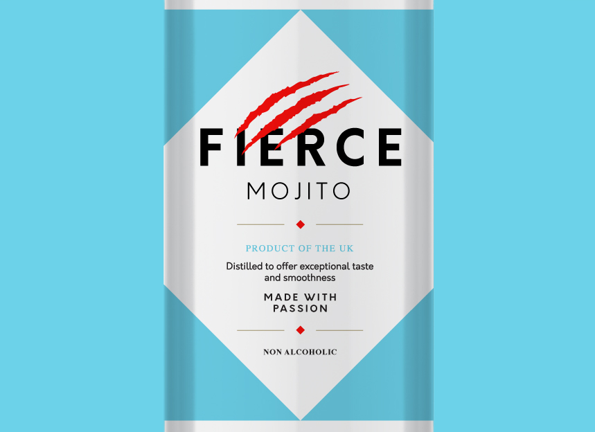
We went for a clean, modern look and feel, one that would resonate with a wide range of age groups. In keeping with the more streamlined, minimalist nature of the design we needed a visual element that said “Fierce” without being too complicated or busy looking. That’s where the claw marks come in, implying someone or something fierce without showing too much.
If you have any branding or packaging projects email or call for a chat. We’ll be nice, promise.

A pretty fierce looking logo

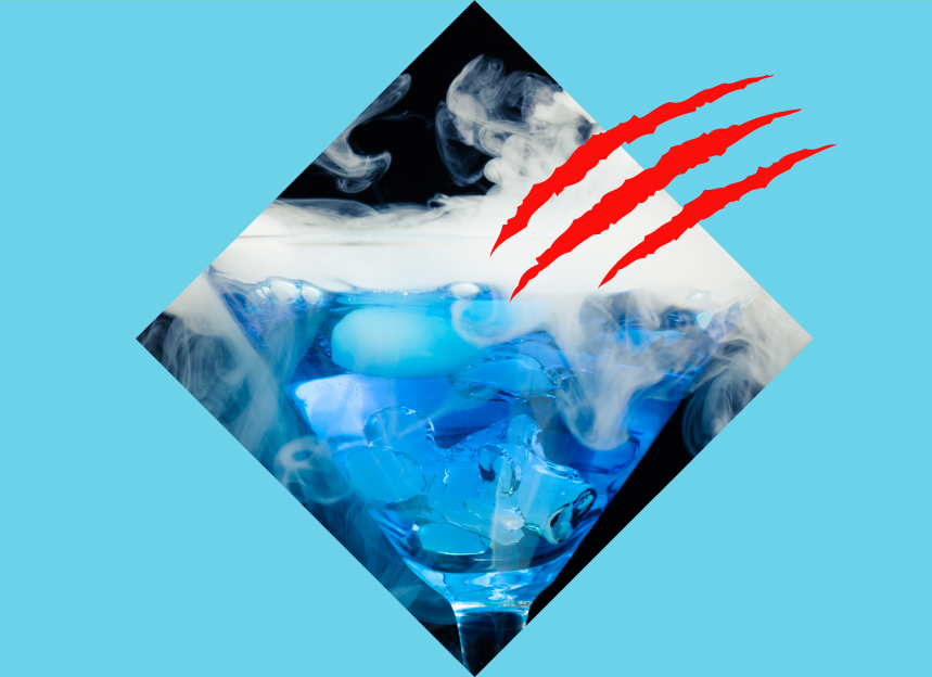
Brand elements – there’s claw marks everywhere!

Zoomed in for your convenience

Makes for a refreshing drink
Lets make something memorable. Complete the enquiry form and we’ll get in touch..