The power of colour in design
Picking colours is easy, right? Well, think carefully because sometimes the wrong colours can have disastrous effects. Those explosions of colour on your website could be sending your customers running out the door. Luckily, it’s easier than you might think to pick the right colours for your design.
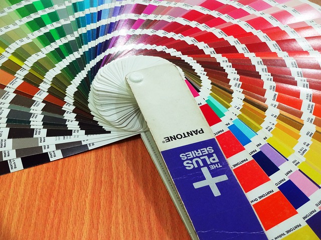
Colour can help you establish your brand identity and also evoke emotions in your audience. Good emotions like happiness and calm are associated with green. Sadness is associated with black or grey. Considered use of colour can also enhance the user experience by adding visual interest and creating a sense of balance on a page.
For instance, if you want to create a bright and bold look for your website design, you might choose colours such as orange, yellow and red. If you want to create a more serious and professional look for your brochure design, you might choose grey or navy blue as the dominant colour.
Some key points to consider when thinking about what colours to use:
- Use colour to help establish your brand identity – a distinctive colour palette can make your brand more memorable and promote positive emotions.
- Use contrast to highlight important elements – dividing content into sections makes it easier to digest and more impactful.
- Make sure that your colours work well together – colours which complement each other make for a more consistent design. Tools like Adobe Color and Coolors can be useful here.