Verso
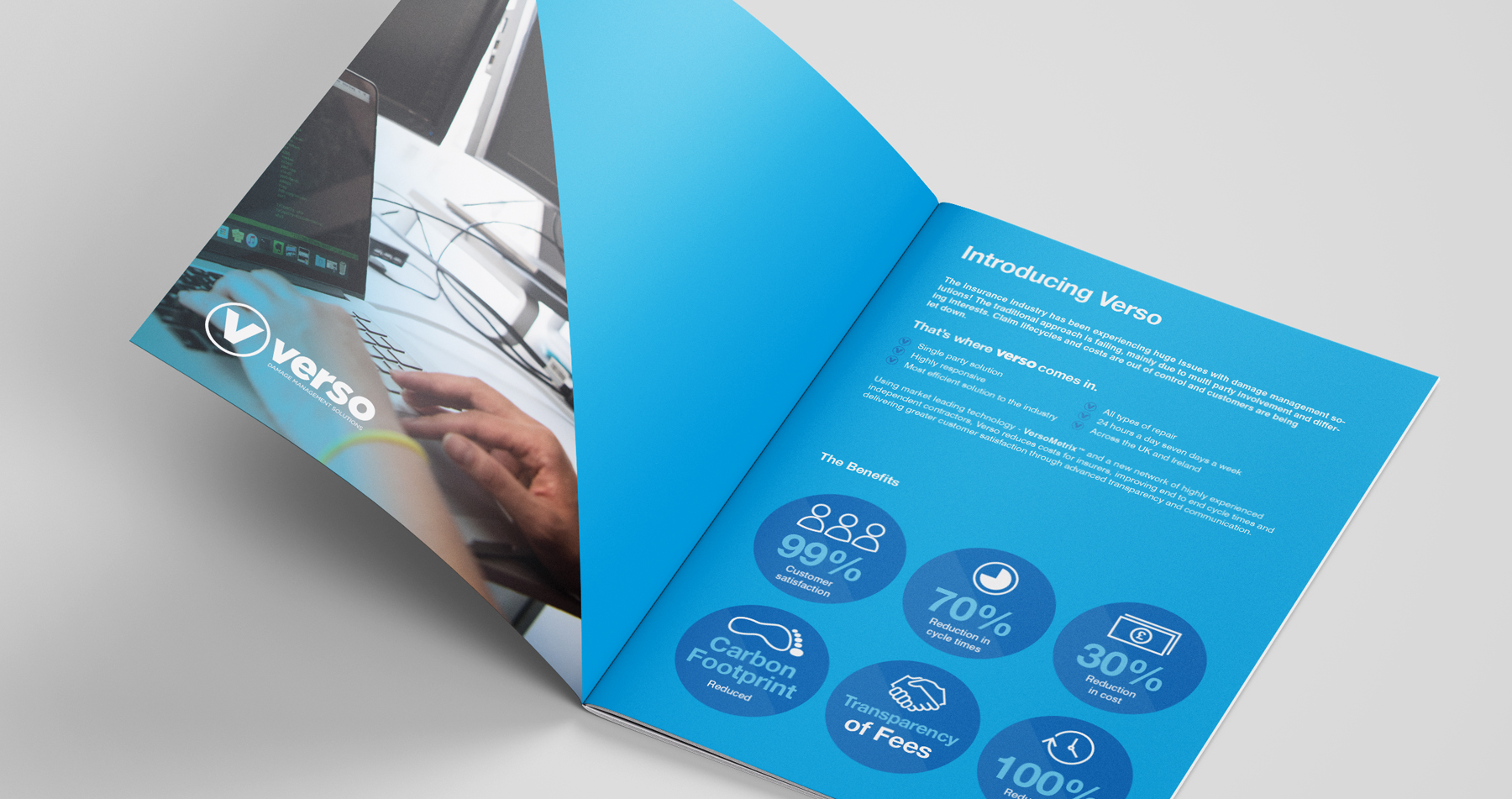
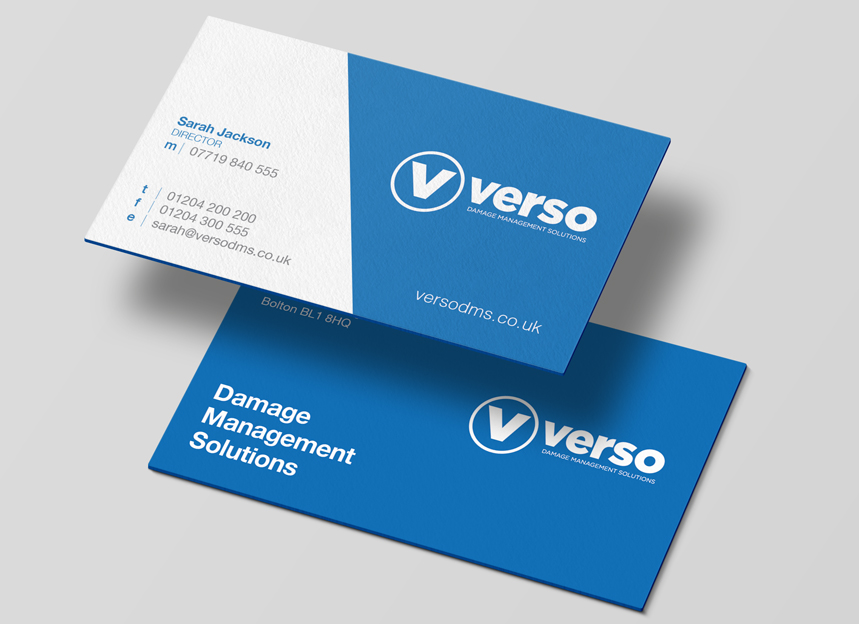
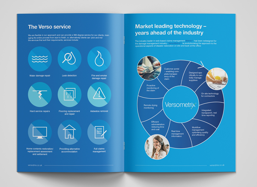
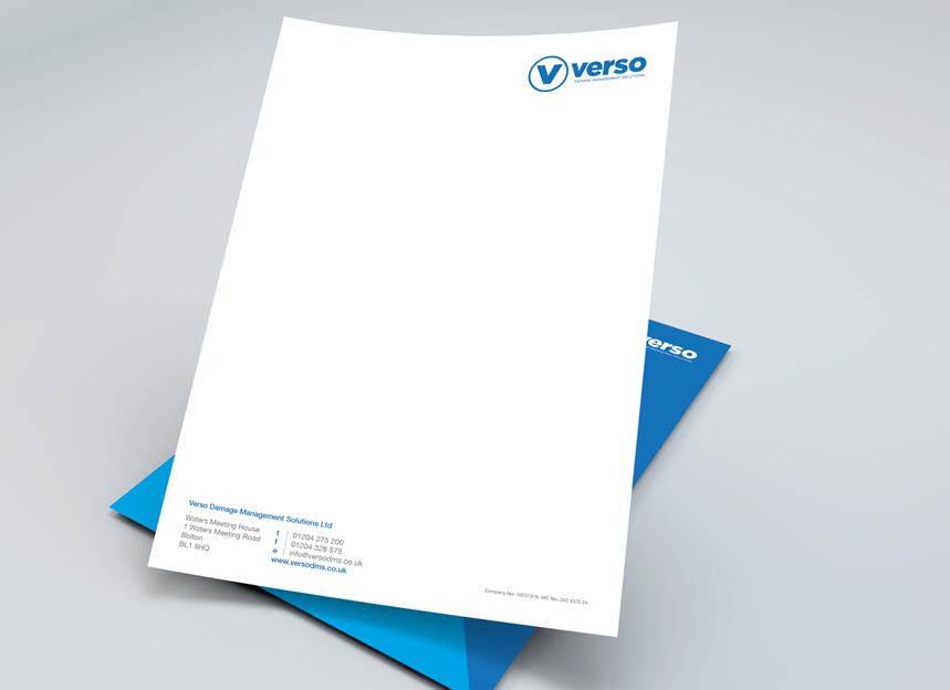
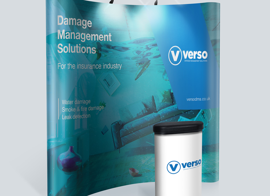
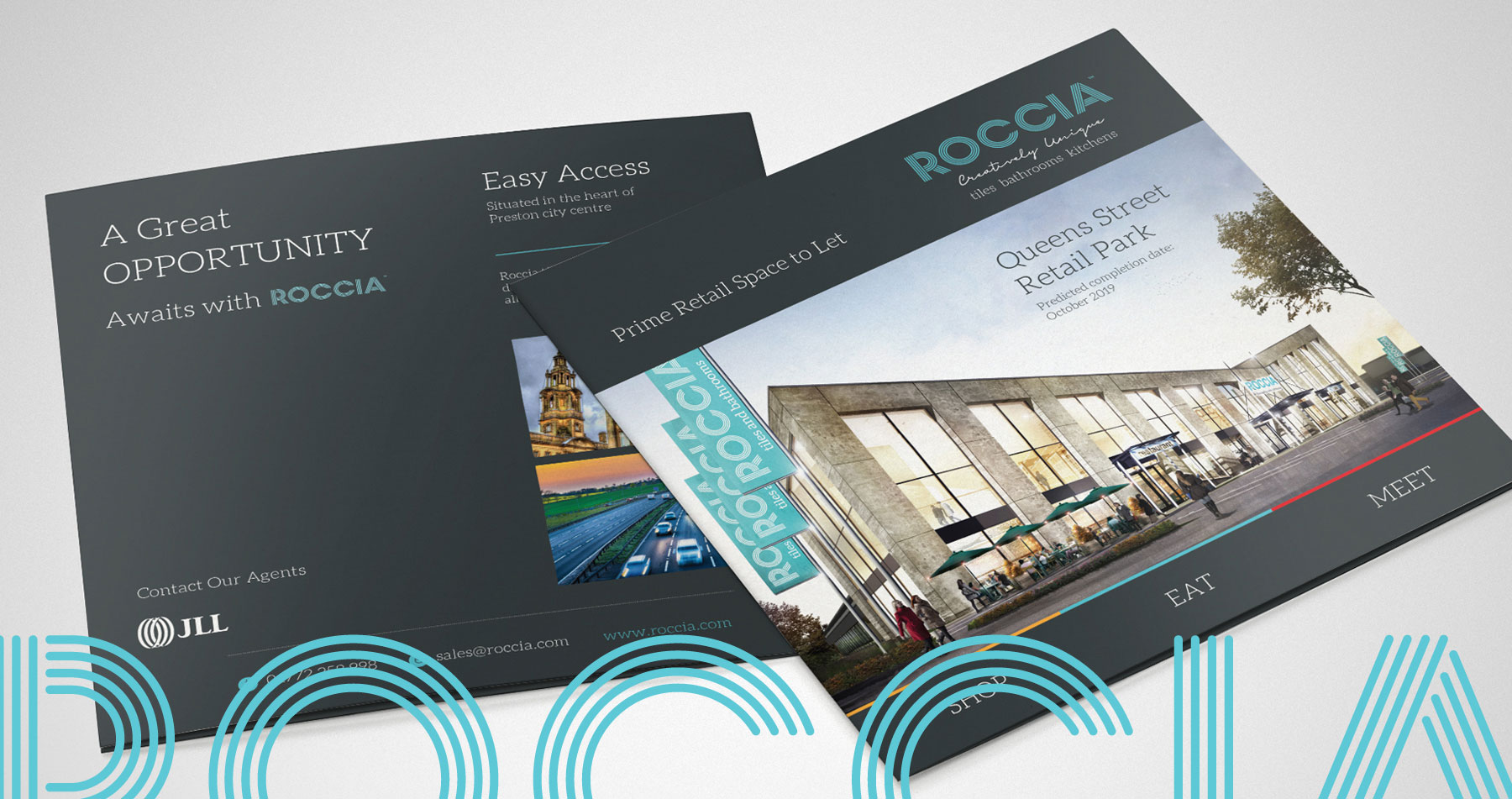
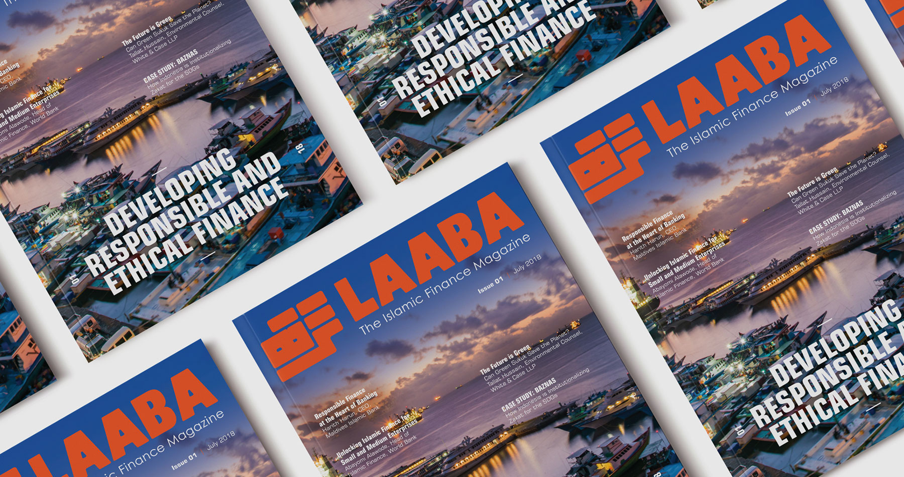
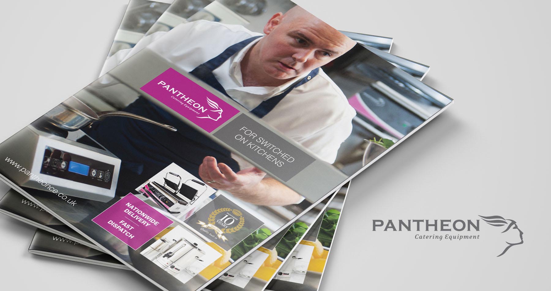
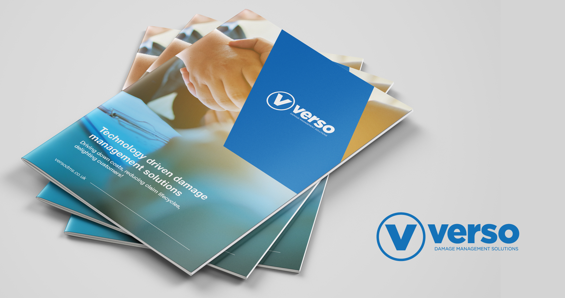
We collaborated with Verso, a market leading damage management solutions company, to rebrand their existing logo and marketing material.
Earlier on in the project, it was decided that the logo needed refinement instead of a complete overhaul. This was due to Verso’s already high visibility in the industry. This included refining the logo mark, and fonts as well as changing the colour of Verso’s brand to a more striking tone.
The next stage was to create a strong and consistent visual style that could be carried across. This was achieved by incorporating the angle from the V of the logo into the various designs.
They approached Red Chilli because they wanted to work with a local agency that was approachable and always ready to lend a hand, either on the other end of the phone or in person.
Get in touch
01204 467 866 | info@redchillidesign.co.uk
